P - Organizing, Visualizing, and Describing Data
In this reading, we have presented tools and techniques for organizing, visualizing, and describing data that permit us to convert raw data into useful information for investment analysis.
- Data can be defined as a collection of numbers, characters, words, and text—as well as images, audio, and video—in a raw or organized format to represent facts or information.
- From a statistical perspective, data can be classified as numerical data and categorical data. Numerical data (also called quantitative data) are values that represent measured or counted quantities as a number. Categorical data (also called qualitative data) are values that describe a quality or characteristic of a group of observations and usually take only a limited number of values that are mutually exclusive.
- Numerical data can be further split into two types: continuous data and dis crete data. Continuous data can be measured and can take on any numerical value in a specified range of values. Discrete data are numerical values that result from a counting process and therefore are limited to a finite number of values.
- Categorical data can be further classified into two types: nominal data and ordinal data. Nominal data are categorical values that are not amenable to being organized in a logical order, while ordinal data are categorical values that can be logically ordered or ranked.
- Based on how they are collected, data can be categorized into three types: cross-sectional, time series, and panel. Time-series data are a sequence of observations for a single observational unit on a specific variable collected over time and at discrete and typically equally spaced intervals of time. Cross-sectional data are a list of the observations of a specific variable from multiple observational units at a given point in time. Panel data are a mix of time-series and cross-sectional data that consists of observations through time on one or more variables for multiple observational units.
- Based on whether or not data are in a highly organized form, they can be classified into structured and unstructured types. Structured data are highly organized in a pre-defined manner, usually with repeating patterns. Unstructured data do not follow any conventionally organized forms; they are typically alternative data as they are usually collected from unconventional sources.
- Raw data are typically organized into either a one-dimensional array or a two-dimensional rectangular array (also called a data table) for quantitative analysis.
- A frequency distribution is a tabular display of data constructed either by counting the observations of a variable by distinct values or groups or by tallying the values of a numerical variable into a set of numerically ordered bins. Frequency distributions permit us to evaluate how data are distributed.
- The relative frequency of observations in a bin (interval or bucket) is the number of observations in the bin divided by the total number of observations. The cumulative relative frequency cumulates (adds up) the relative frequencies as we move from the first bin to the last, thus giving the fraction of the observations that are less than the upper limit of each bin.
- A contingency table is a tabular format that displays the frequency distributions of two or more categorical variables simultaneously. One application of contingency tables is for evaluating the performance of a classification model (using a confusion matrix).
- Visualization is the presentation of data in a pictorial or graphical format for the purpose of increasing understanding and for gaining insights into the data.
- A histogram is a bar chart of data that have been grouped into a frequency distribution. A frequency polygon is a graph of frequency distributions obtained by drawing straight lines joining successive midpoints of bars rep resenting the class frequencies.
- A bar chart is used to plot the frequency distribution of categorical data, with each bar representing a distinct category and the bar’s height (or length) proportional to the frequency of the corresponding category. Grouped bar charts or stacked bar charts can present the frequency distribution of multiple categorical variables simultaneously.
- A tree-map is a graphical tool to display categorical data. It consists of a set of colored rectangles to represent distinct groups, and the area of each rect angle is proportional to the value of the corresponding group. Additional dimensions of categorical data can be displayed by nested rectangles.
- A word cloud is a visual device for representing textual data, with the size of each distinct word being proportional to the frequency with which it appears in the given text.
- A line chart is a type of graph used to visualize ordered observations and often to display the change of data series over time. A bubble line chart is a special type of line chart that uses varying-sized bubbles as data points to represent an additional dimension of data.
- A scatter plot is a type of graph for visualizing the joint variation in two numerical variables. It is constructed by drawing dots to indicate the values of the two variables plotted against the corresponding axes. A scatter plot matrix organizes scatter plots between pairs of variables into a matrix for mat to inspect all pairwise relationships between more than two variables in one combined visual
- A heat map is a type of graphic that organizes and summarizes data in a tabular format and represents it using a color spectrum. It is often used in displaying frequency distributions or visualizing the degree of correlation among different variables.
- The key consideration when selecting among chart types is the intended purpose of visualizing data (i.e., whether it is for exploring/presenting distributions or relationships or for making comparisons).
- A population is defined as all members of a specified group. A sample is a subset of a population.
- A parameter is any descriptive measure of a population. A sample statis tic (statistic, for short) is a quantity computed from or used to describe a sample.
- Sample statistics—such as measures of central tendency, measures of dispersion, skewness, and kurtosis—help with investment analysis, particularly in making probabilistic statements about returns.
- Measures of central tendency specify where data are centered and include the mean, median, and mode (i.e., the most frequently occurring value).
- The arithmetic mean is the sum of the observations divided by the number of observations. It is the most frequently used measure of central tendency.
- The median is the value of the middle item (or the mean of the values of the two middle items) when the items in a set are sorted into ascending or descending order. The median is not influenced by extreme values and is most useful in the case of skewed distributions.
- The mode is the most frequently observed value and is the only measure of central tendency that can be used with nominal data. A distribution may be unimodal (one mode), bimodal (two modes), or trimodal (three modes) or have even more modes.
- A portfolio’s return is a weighted mean return computed from the returns on the individual assets, where the weight applied to each asset’s return is the fraction of the portfolio invested in that asset.
- The geometric mean,
of a set of observations , is , with ≥ 0 for i = 1, 2, …, n. The geometric mean is especially important in reporting compound growth rates for time-series data. The geometric mean will always be less than an arithmetic mean whenever there is variance in the observations. - The harmonic mean,
, is a type of weighted mean in which an observation’s weight is inversely proportional to its magnitude. - Quantiles—such as the median, quartiles, quintiles, deciles, and percentiles—are location parameters that divide a distribution into halves, quarters, fifths, tenths, and hundredths, respectively.
- A box and whiskers plot illustrates the interquartile range (the “box”) as well as a range outside of the box that is based on the interquartile range, indicated by the “whiskers.”
- Dispersion measures—such as the range, mean absolute deviation (MAD), variance, standard deviation, target downside deviation, and coefficient of variation—describe the variability of outcomes around the arithmetic mean.
- The range is the difference between the maximum value and the minimum value of the dataset. The range has only a limited usefulness because it uses information from only two observations
- The MAD for a sample is the average of the absolute deviations of observations from the mean,
, where is the sample mean and n is the number of observations in the sample. - The variance is the average of the squared deviations around the mean, and the standard deviation is the positive square root of variance. In computing sample variance (
) and sample standard deviation (s), the average squared deviation is computed using a divisor equal to the sample size minus 1. - The target downside deviation, or target semi-deviation, is a measure of the risk of being below a given target. It is calculated as the square root of the average squared deviations from the target, but it includes only those observations below the target (B), or
. - The coefficient of variation, CV, is the ratio of the standard deviation of a set of observations to their mean value. By expressing the magnitude of variation among observations relative to their average size, the CV permits direct comparisons of dispersion across different datasets. Reflecting the correction for scale, the CV is a scale-free measure (i.e., it has no units of measurement)
Questions
1]
Published ratings on stocks ranging from 1 (strong sell) to 5 (strong buy) are examples of which measurement scale?
Ordinal
2]
Data values that are categorical and not amenable to being organized in a logical order are most likely to be characterized as Nominal.
3]
Nominal would be classified as being categorical.
4]
A fixed-income analyst uses a proprietary model to estimate bankruptcy probabilities for a group of firms. The model generates probabilities that can take any value between 0 and 1. The resulting set of estimated probabilities would most likely be characterized as continuous data.
5]
An analyst uses a software program to analyze unstructured data—specifically, management’s earnings call transcript for one of the companies in her research coverage. The program scans the words in each sentence of the transcript and then classifies the sentences as having negative, neutral, or positive sentiment. The resulting set of sentiment data would most likely be characterized as ordinal data.
6-7
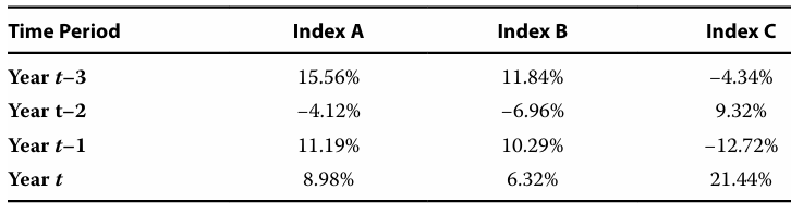
6]
Each individual column of data in the table can be best characterized as time-series data.
7]
Each individual row of data in the table can be best characterized as cross-sectional data.
8]
A two-dimensional rectangular array would be most suitable for organizing a collection of raw panel data.
9]
In a frequency distribution, the absolute frequency measure represents the actual number of observations counted for each unique value of the variable.
10]
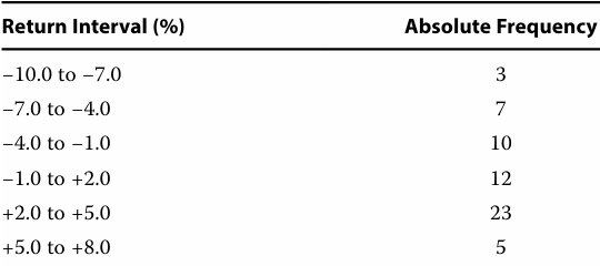
The relative frequency of the bin “−1.0 to +2.0” is 20%.
11]
12-13
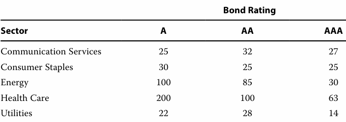
12]
The marginal frequency of energy sector bonds is closest to 215.
13]
The relative frequency of AA rated energy bonds, based on the total count, is 10.5%.
14]
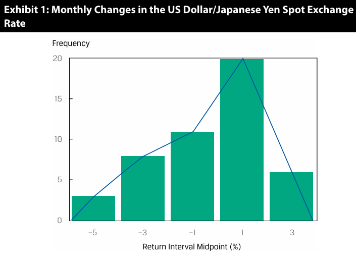
Yen appreciation occurred more than 50% of the time.
15]
A bar chart that orders categories by frequency in descending order and includes a line displaying cumulative relative frequency is referred to as a Pareto Chart.
16]
Word cloud works best to represent unstructured, textual data.
17]
A tree-map is best suited to illustrate value differences of categorical groups.
18]
A line chart with two variables—for example, revenues and earnings per share— is best suited for visualizing underlying trends in the variables over time.
19]
A heat map is best suited for visualizing the degree of correlation between different variables.
20]
Bubble line chart is recommended to be used if the goal is to make comparisons of three or more variables over time.
21-22
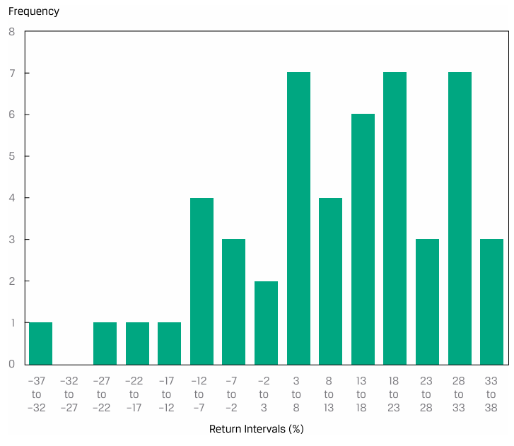
21]
The bin containing the median return is 13% to 18%.
22]
Based on the previous histogram, the distribution is best described as being trimodal.
23]
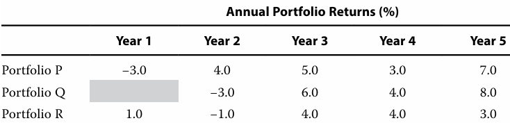
The median annual return from portfolio creation to Year 5 for Portfolio R is higher
than its arithmetic mean annual return.
24]
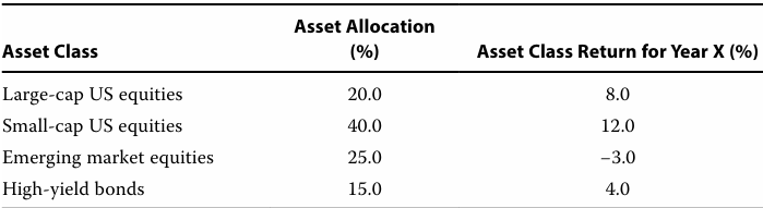
The portfolio return for Year X is closest to 6.25%.
25]
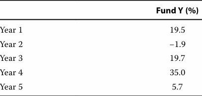
The geometric mean return for Fund Y is closest to
Fund Y =
= 14.9%
26]
A portfolio manager invests €5,000 annually in a security for four years at the prices shown in the following exhibit.
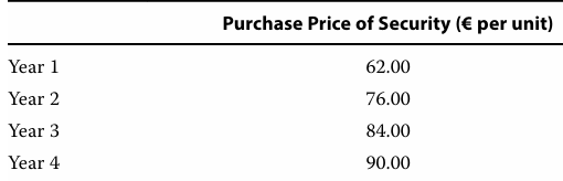
The average price is best represented as the harmonic mean of €76.48.
27]
When analyzing investment returns, the geometric mean measures an investment’s compound rate of growth over multiple periods.
28-32
---
28]
The arithmetic mean return over the 10 years is closest to 3%.
(With (1+R))
29]
The geometric mean return over the 10 years is closest to 2.97%.
30]
The arithmetic mean return over the 10 years is closest to 2.94%.
(With n-1)
31]
The standard deviation of the 10 years of returns is closest to 2.52%.
32]
The target semi deviation of the returns over the 10 years if the target is 2% is closest to 1.5%.
33-34
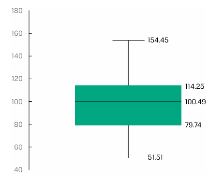
33]
The median is closest to 100.49.
34]
The interquartile range is closest to 34.51.
35-36
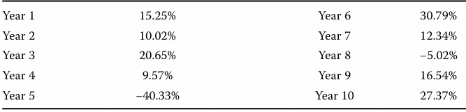
35]
The fourth quintile return for the MSCI World Index is closest to
= 20.65 + (8.8 - 8)(27.37 - 20.65)
= 26.03%
36]
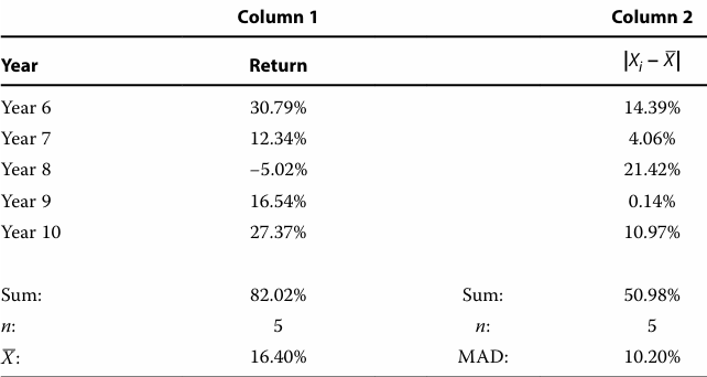
For Year 6–Year 10, the mean absolute deviation of the MSCI World Index total returns is closest to:
37]
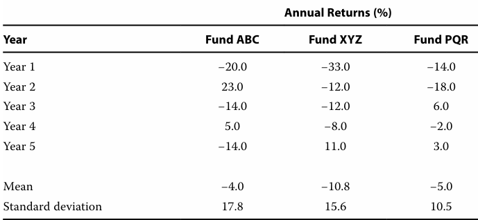
The fund with the highest absolute dispersion is Fund ABC if the measure of dispersion is the mean absolute deviation.
- ABC (14.4%), PQR (8.8%), XYZ(9.8%)
38]
The average return for Portfolio A over the past twelve months is 3%, with a standard deviation of 4%. The average return for Portfolio B over this same period is also 3%, but with a standard deviation of 6%. The geometric mean return of Portfolio A is 2.85%. The geometric mean return of Portfolio B is less than 2.85%.
39]
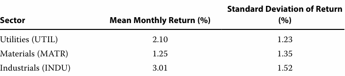
Based on the coefficient of variation, the riskiest sector is materials.
- UTIL (0.59), MATR (1.08), INDU (0.51)